June 30, 2022
Exploring relationships between news and market data using time series analysis
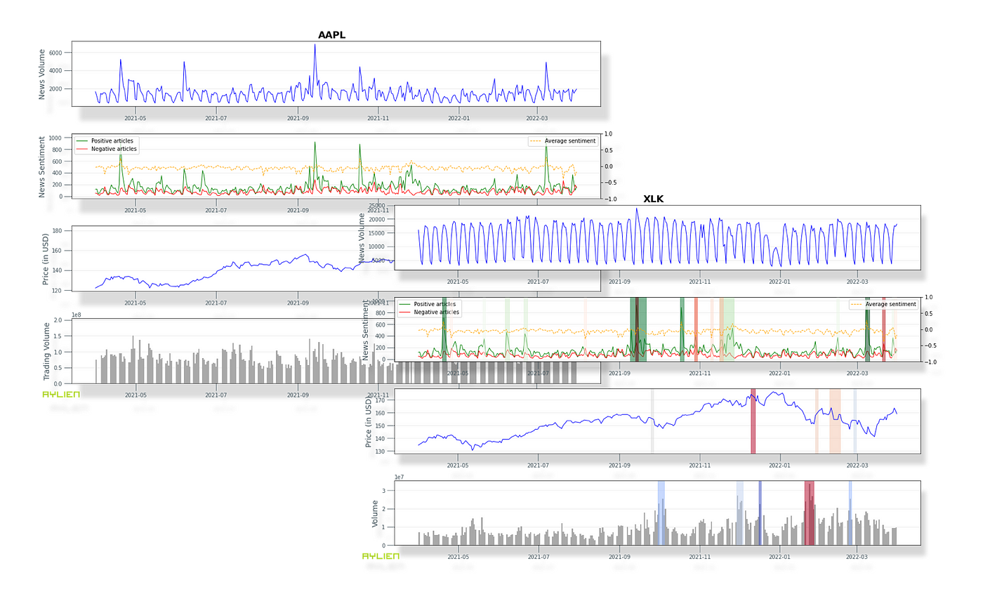 By Parsa Ghaffari and Chris Hokamp — May 2022 — All images by authors
TL;DR — In this article we introduce a few tools and techniques for studying relationships between the stock market and the news. We explore time series processing, anomaly detection, and an event-based view of the news. We also generate intuitive charts to demonstrate some of these concepts, and share the code behind all of this in a notebook.
You can view the code in this notebook.
Introduction
The impact of news on markets has been an area of strong interest for many years, and with the advent of quantitative analysis, many from academics to quants have used statistical methods to better understand the relationship between news and market data, such as stock prices or trade volumes.
In this article we aim to provide a simple practical guide for exploring statistical relationships between news data and the market, as a foundation for deeper and more targeted analyses. Our goal is to provide a set of tools to the reader that will assist them in exploring and cross referencing financial and news data. Our goal is NOT to predict the stock market, or discover specific correlations or causal relationships between the news and the market.
Aligning market data with the news
In order to study the relationship between news and market data, we first leverage Aylien’s News API which allows users to filter the world’s news data, both real-time and historical, using a comprehensive set of filters. We use these filters to create news feeds that correspond to our securities of interest (e.g. stocks, ETFs, cryptos, etc). We then use Yahoo! Finance to retrieve the market data (price and volume) for these securities. Putting the two together, we can construct a joint dataset consisting of both market and news-related data for any given security, in a timeframe of choice.
The table below summarizes corresponding News API filters for various types of financial entities:
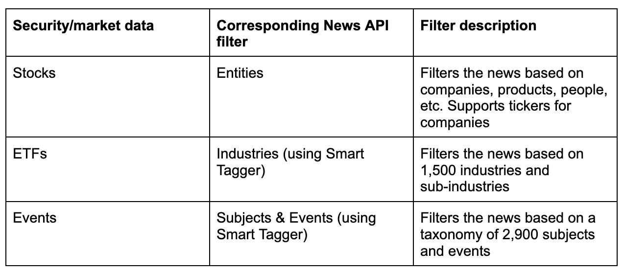
We can also leverage additional filtering options available in the News API such as Sources and Geographies to further refine our news feeds, which may be useful depending on the task at hand.
Although we’re primarily using price and volume data from the market in this article, it is worth mentioning that many of the techniques we explore in this post are extendable to other types of financial or economical data, for instance in order to study the relationship between layoffs and the news, we could retrieve historical layoff data from statistics offices, and align them with the news using the News API’s events filters (e.g. to retrieve news articles that are explicitly about layoffs and workforce-related announcements).
A few basic examples
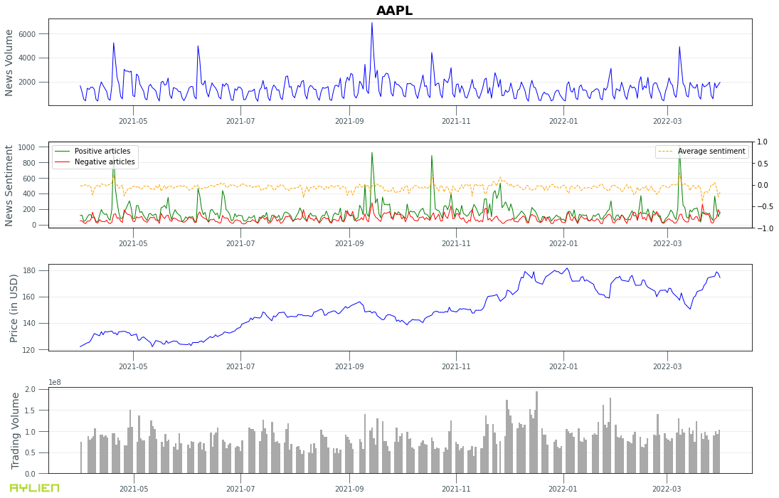
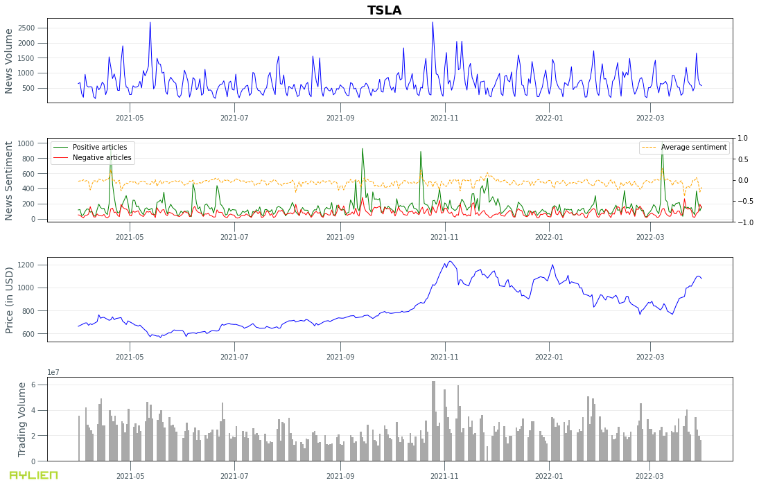
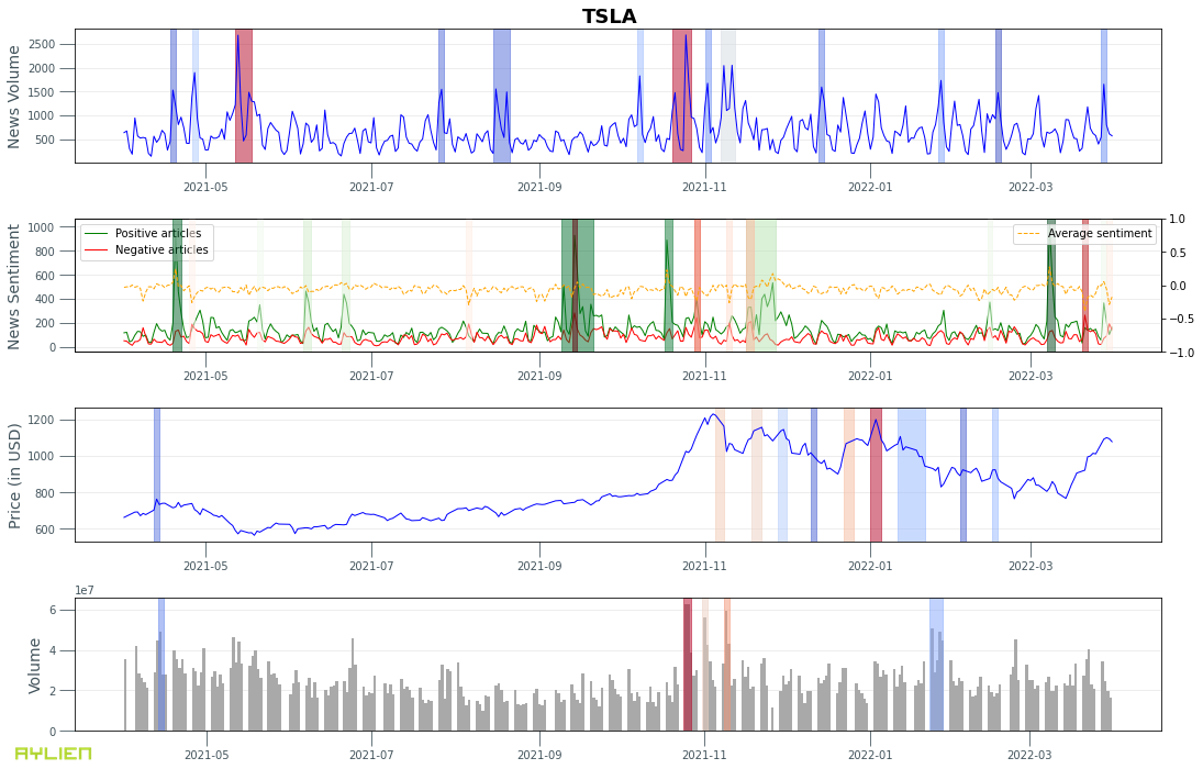
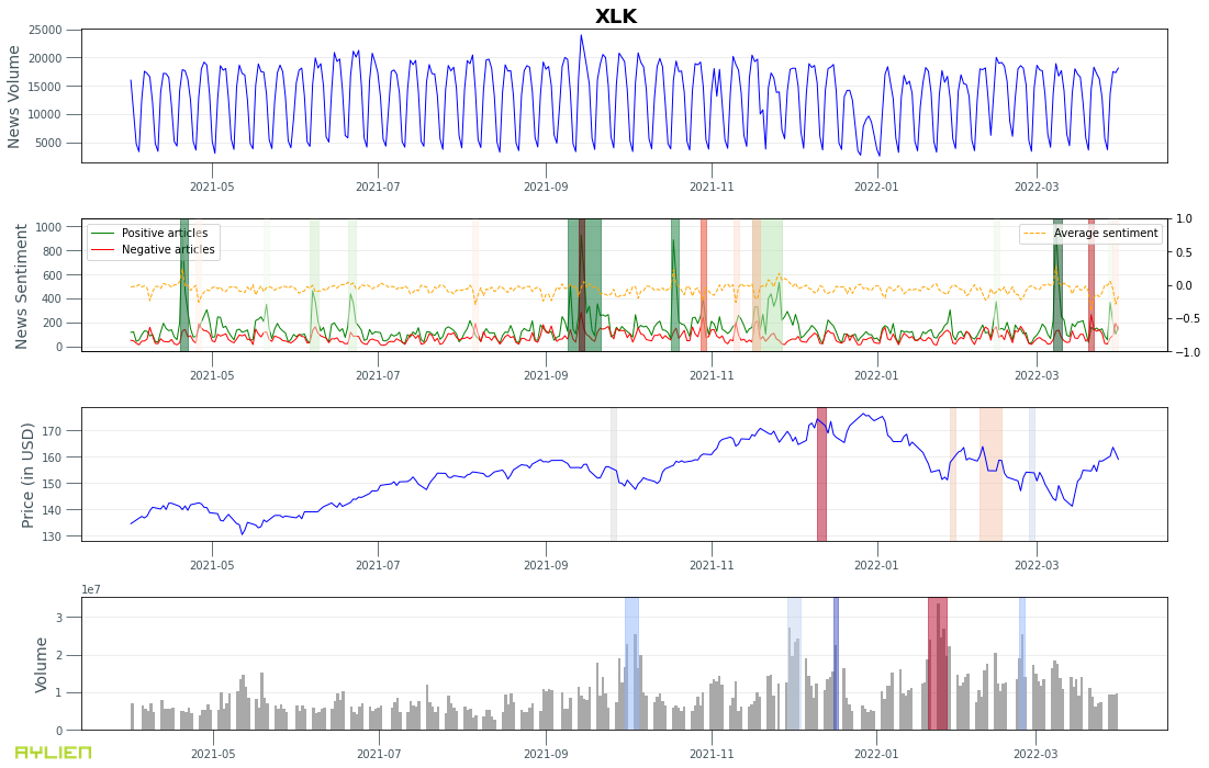
To demonstrate the concept of alignment better, let’s look at a few basic examples. We’re going to study two technology companies, Apple and Tesla, along with the technology sector ETF, XLK, and finally the S&P index (GSPC). For each entity we’re going to fetch and plot the news and market data on a single chart for a period of 1 year from April 1st, 2021 to April 1st, 2022. There are a number of parameters available to us for market and news data, such as:

Example 1. Apple Inc (AAPL) news volume, sentiment, stock price, and trade volume.
Example 2. Tesla Inc (TSLA) news volume, sentiment, stock price, and trade volume.
Example 3. Technology sector ETF (XLK) news volume, sentiment, stock price, and trade volume.
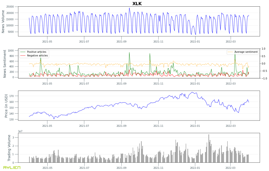
This is a quick and easy way to compare movements between various time series visually. In the next section we will look into how we can find and compare interesting points on these time series more concretely as a step towards studying causal and correlational relationships.
Studying deeper relationships
Time Series Analysis
So far we’ve retrieved time series data reflecting news (article count, sentiment) and market (stock price, trade volume) attributes in an aligned fashion. In order to further break down and understand these time series, we will employ a few time series analysis techniques. We will use Meta’s Kats library which offers a range of time series analysis tools.
1. Preprocessing
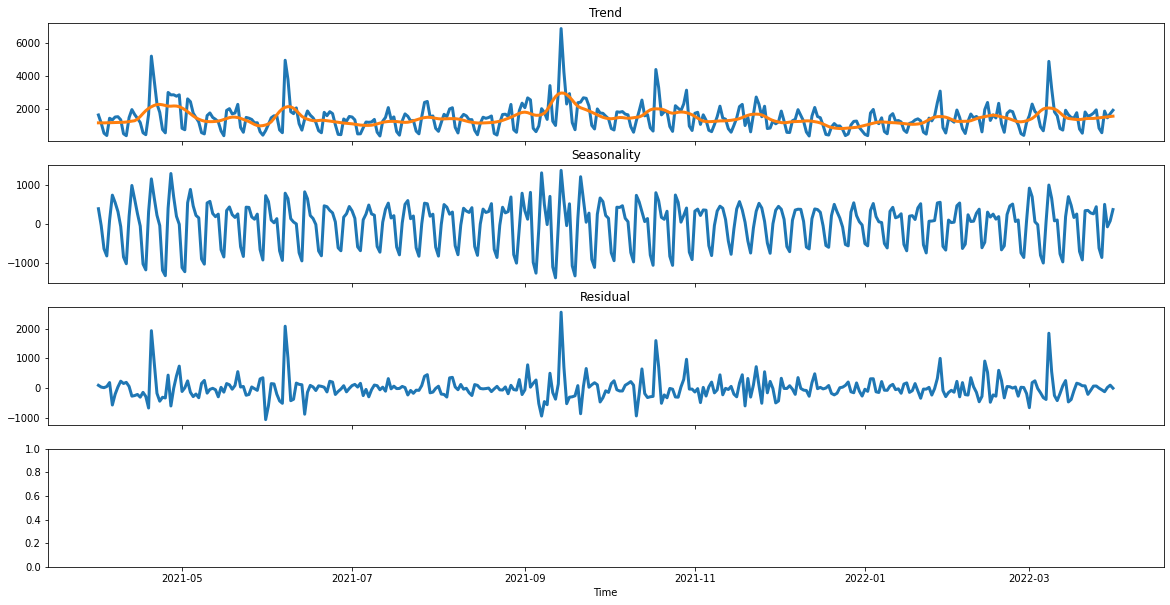
Let’s start by decomposing our time series, to identify and normalize trends and seasonality in our time series.
We will apply Kats’ decomposition utility in “additive” mode to each of our time series.
Example 4. News volume time series for Apple Inc (AAPL) decomposed into trend, seasonality and residual.
2. Forecasting
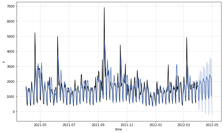
Another useful utility in the Kats package is its forecasting module. Kats support various time series forecasting techniques, including SARIMA, Prophet (a forecasting library by Meta), and Holt-Winters, as well as ensemble forecasting models. Each of these techniques come with pro’s and con’s and require parameter tuning to work optimally for a given time series. You can read more about the Kats forecasting module here.
Please note that we’re introducing forecasting as a time series analysis technique here. Our goal is NOT to predict future news volumes or stock prices.
Example 5. 1 month forecast of news articles volume for Apple Inc (AAPL) using Holt-Winters
3. Changepoint Detection
Changepoint detection tries to identify times when the probability distribution of a stochastic process or time series changes, e.g. the change of mean in a time series. It is one of the most popular detection tasks in time series analysis.
Similar to forecasting, Kats supports various changepoint detection models. These include:
- CUSUM, as a method to detect an up/down shift of means in a time series
- Bayesian Online Change Point Detection (BOCPD), as a method for detecting sudden changes in a time series that persist over time
- RobustStatDetector, which similar to CUSUM is a change point detection algorithm that finds mean shifts in time series data
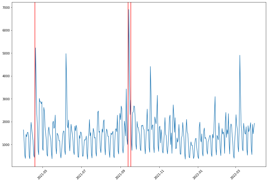
To demonstrate this concept better, we will apply BOCPD to the Apple news volume time series to identify sudden jumps in the news coverage about Apple.
Example 6. Bayesian Online Change Point Detection (BOCPD) applied to the volume of news articles about Apple Inc (AAPL).
4. Anomaly Detection
Anomalies are an important aspect of any time series data, that for a relatively steady activity such as the number of news articles written about a large company like Apple, reflect fundamental shifts in the underlying inputs, which in turn potentially reflect important real-world changes such as earnings announcements or new product releases.
We’ve implemented a simple but powerful algorithm that identifies anomalies in our time series data by detecting points that are outside the interquartile range after correcting the time series data for trend and seasonality. The output from this algorithm is a series of one or more windows of interest.
A similar algorithm is currently in use by some of Aylien’s customers who are interested in notifying their traders about interesting movements in the market which may be related to a news headline in that timeframe.
Example 7. Anomaly detection applied to news volume, news sentiment, stock price and trade volume for Apple Inc (AAPL).
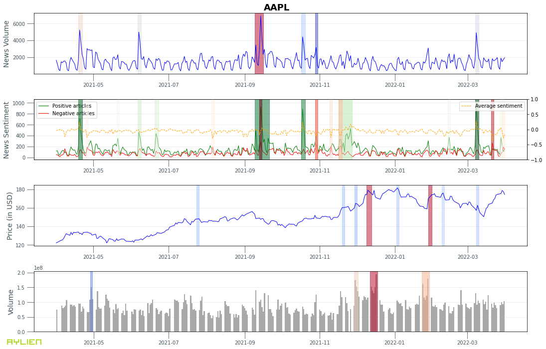
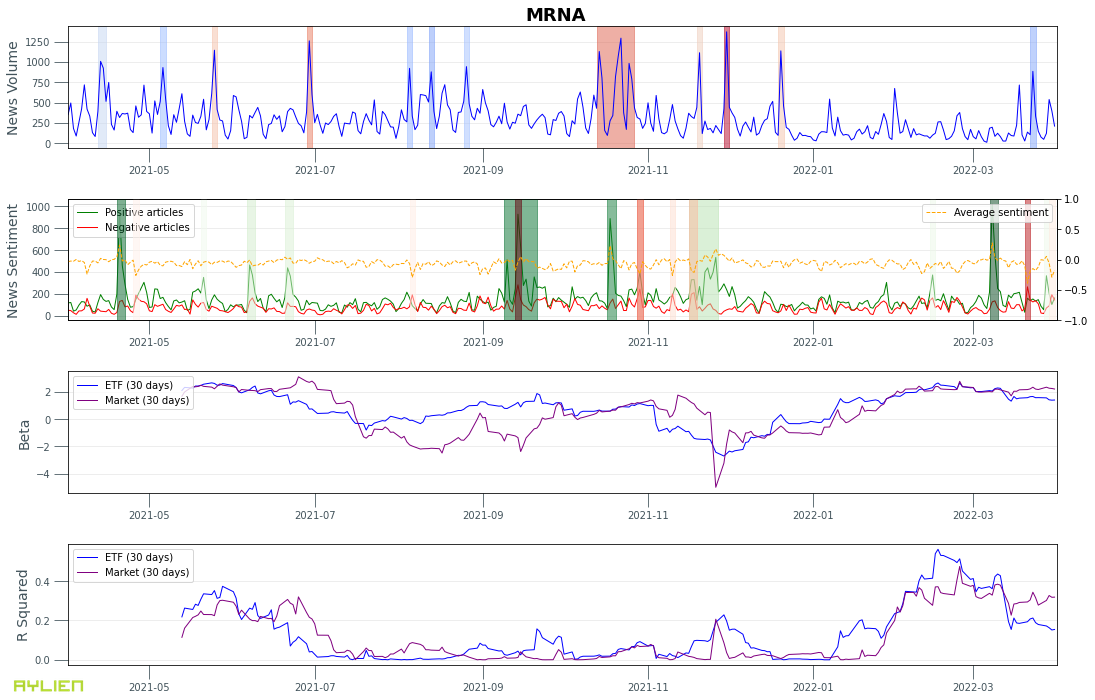
The significance of each anomaly is indicated using a color from blue (weak) to red (strong). For sentiment anomalies we use green to demonstrate positive and red for negative anomalies. We can see some overlaps between anomalies in the news volume and news sentiment. Additionally some anomalies in the positive sentiment time series seem to precede anomalous trade volumes.
5. Correlations (Beta and R-squared)
When looking at movements in the stock price or trade volume, it’s important to understand whether those movements happened independently or in correlation with the market. Intuitively, perhaps we could expect to see a more prominent correlation between news and market activity when a security moves independently from the market, or at moments where the movement is less dependent on the market.
In order to study this hypothesis, we can leverage two well known financial indicators: Beta and R-squared.
Beta is a derived statistic that measures the variance or volatility of a stock against the overall market or a benchmark stock/index. In theory, high-beta stocks deliver outsized performance when the market goes up, and outsized underperformance when the market goes down. To calculate beta for a stock, we can plot its change vs. changes in a benchmark stock/index (e.g the S&P 500) and find the linear regression line that best fits the data. The slope of that line represents beta.
R-squared measures the degree to which a security’s performance can be attributed to the performance of the selected benchmark index. In other words, R-squared aims to determine how much of the movement in an asset can be explained by the movements in the market.
Example 8. News volume/sentiment, and Beta and R-squared relative to the S&P index and the technology sector ETF (XLK) for Apple Inc (AAPL).
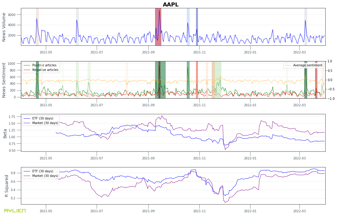
We can see that Apple’s movements are more correlated with the tech sector than the overall market (the blue line is mostly above the purple line in the R Squared chart).
6. News Events
A powerful feature in Aylien’s News API is its ability to categorize articles based on subjects, events, and industries (this feature is called Smart Tagger). Aylien uses highly granular taxonomies and NLP models that identify linguistic fragments that are associated with specific business events (e.g. mergers and acquisitions or commentary from analysts) or industries (e.g. technology or pharmaceuticals).
We can leverage this capability to break down the news volume time series into individual time series for key business events, for instance:
- New Products — news about new product releases
- Layoffs — news about layoffs
- Analyst Comments — analyst comments on the stock, earning announcements, etc
- Stocks — articles relevant to the stock market
- Corporate Earnings — corporate earning announcements
- Mergers & Acquisitions — news about M&A events
- Store Openings — new store openings for consumer businesses
Example 9. News articles time series broken down by event type for Apple Inc (AAPL).
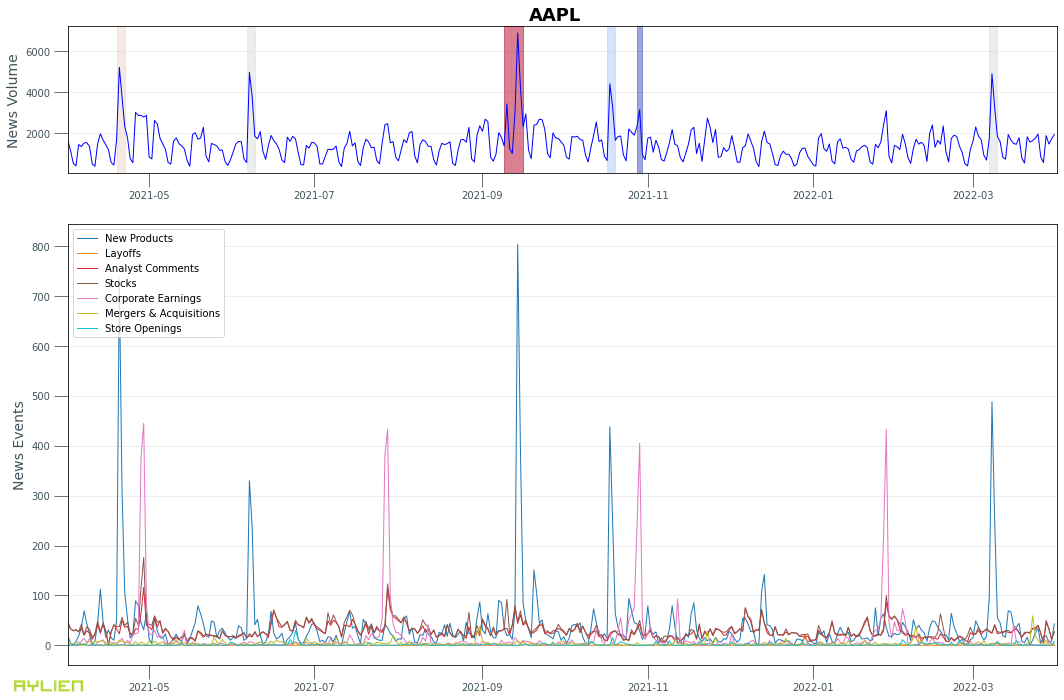
It’s worth paying attention to the consistency of news articles about Apple’s earnings announcements in terms of volume and frequency (quarterly), as well as the spikes in articles labeled as “New Products” when Apple announces new products.
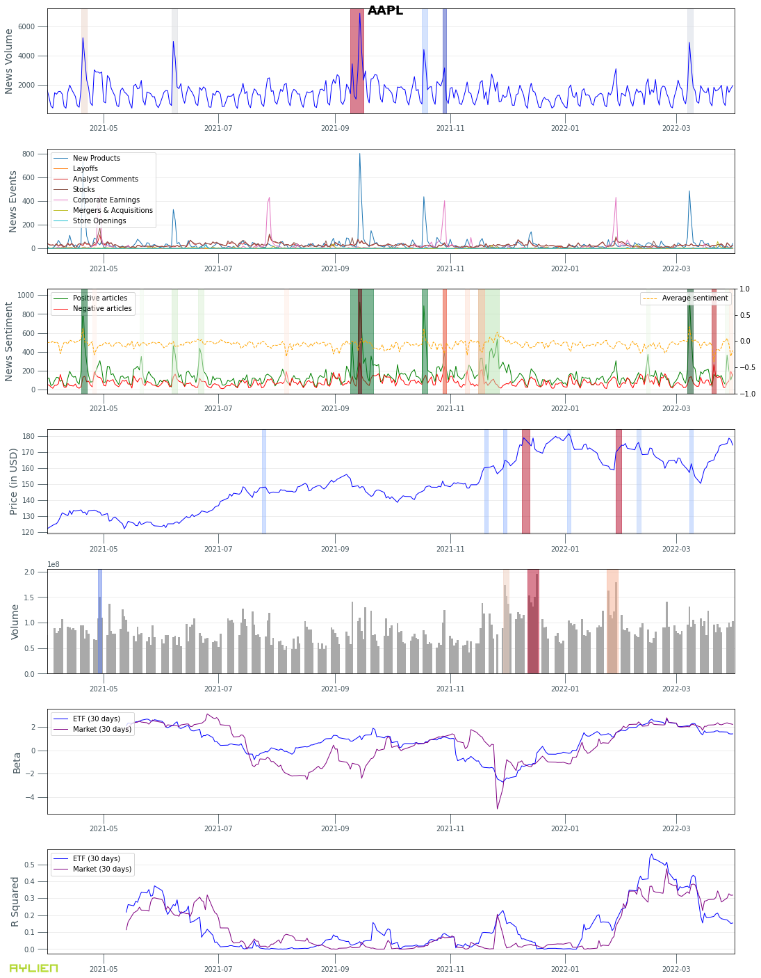
Putting all the previous charts together, we get a fairly rich and comprehensive set of time series data to work with for further analysis:
Conclusion
In this article we explored some basic and advanced concepts for studying relationships between market and news data, and introduced a few building blocks that can be used to perform more detailed analyses.
- We demonstrated how market and news data can be retrieved and aligned for stocks or ETFs of interest;
- We introduced a few pre-processing steps for time series data and analysis;
- We explored a few different techniques for identifying and aligning anomalies between various time series data; and
- We looked at how news time series data can be broken down by semantic properties of the underlying news articles, such as sentiment or categories.
Future Work
Some of the interesting directions to explore after this work are listed below:
- Multivariate anomaly detection: To detect anomalies across multiple time series, to identify small anomalies that are persistent across multiple time series, between news and market data.
- Similarity search between time series: To identify similarities between various time series using pattern recognition.
- Exploring causality models such as Granger Causality, to identify signals in one time series that can be good predictors for another time series.
- Expand this work to other types of securities (e.g. crypto or commodities) and market signals (e.g. macroeconomic indicators).
Appendix
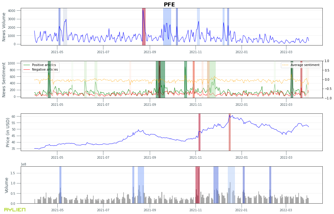
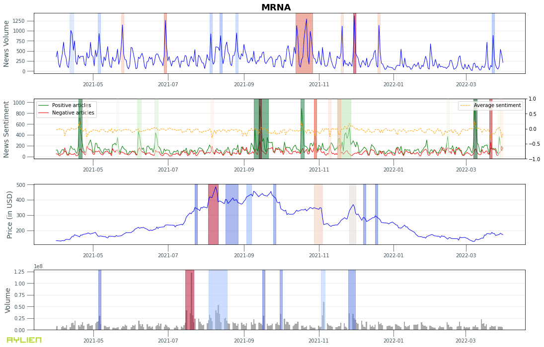
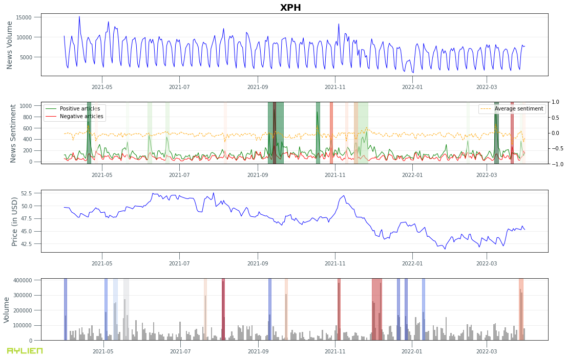
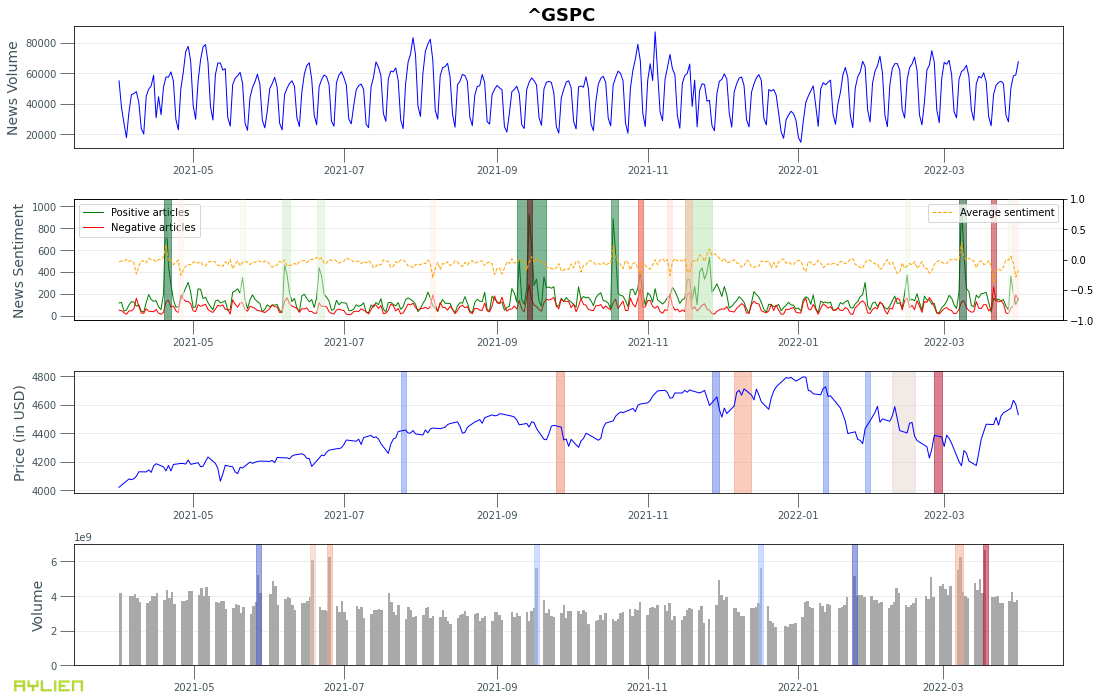
- News volume, news sentiment, stock price and trade volume charts for:
- Apple Inc (AAPL)
- Tesla Inc (TSLA)
- XLF — Technology sector ETF
- Pfizer Inc (PFE)
- Moderna Inc (MRNA)
- XPH — Pharmaceuticals sector ETF
- S&P Index

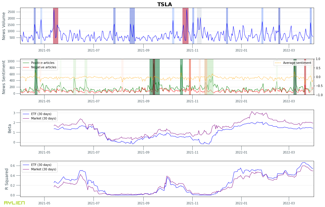
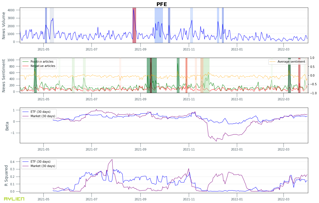
- News volume, news sentiment, beta and r-squared for:
- Apple Inc (AAPL)
- Tesla Inc (TSLA)
- Pfizer Inc (PFE)
- Moderna Inc (MRNA)

Next post Stock-NewsEventsSentiment (SNES) 1.0: A time-series dataset for joint news and market data analysis of stocks TL;DR — We’re releasing a time-series dataset for S&P 500 companies that joins market data–such as stock price and trade volume–with news events and